See the registration form that will bring you thousands of subscribers.
What is the importance of a dynamic registration form.
The first step to successful email marketing is to create a quality subscriber list. The best way is to target your page visitors. This is because they are users who have already expressed interest in your brand and your products/services. Of course, even so, you can't be aggressive and annoying. You don't want to drive the user away by providing a bad experience. So below we'll look at all the options you have and when it's good to use each one.
Types of subscriber registration form
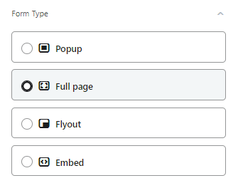
- The pop-up windows (Popup) appear in the middle of the browser window. A pop-up window attracts attention and is best used for important offers or critical messages. The pop-ups have the highest conversion rate from any type of form.
- The Flyouts "slide" into the browser window from whichever direction you choose. These, like pop-ups, can be used to persuade someone to complete something or redirect them, but because it's a less intrusive option, you can use it to collect information about the user.
- There are the embedded forms (Embed) where they are embedded on your website. Embedded forms are the least intrusive registration forms and are typically used to collect email addresses in place of the static form that may have existed before.
- The full page forms (Full Page) appear in the entire browser window, getting the full attention of your shoppers. These are high conversion forms, as they cannot be easily overlooked, however this also makes them more intrusive as buyers have to interact with the form to close it.
Perfect time to display your form
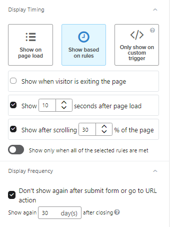
Show on page load - If you want your form to appear immediately when someone visits a page on your site, select "Show on page load". Ideally, choose one or more of the following options to achieve a better user experience:
Show when visitor is exiting the page - This allows you to target the user when they intend to leave the page. Exit intent forms are triggered when someone places the mouse near the browser tabs on a desktop computer and if someone scrolls quickly upwards on mobile.
Show __ seconds after page load - You can choose the number of seconds that someone must be on the page before the form loads. For example, if you enter one second, the form will appear after someone has been on a website for one second. Ideally, make sure to display your message before the user leaves the page.
Show after scrolling __% of the page - If you select delayed scrolling, someone must scroll to a specific point on the page for the form to load. The 0% rate is the top of the page, while 100% is the bottom.
Note the switch that appears below the delay options that allows you to display the form only when all the selected rules are met. If multiple delays are selected, all must be satisfied for the form to display. For example, if you select exit intent and set the form to display after someone scrolls to the middle of the page, a visitor must complete both actions (scrolling to the middle of the page and then displaying exit intent) for the form to display. Someone who as soon as they entered your page went to leave is not a quality subscriber.
Don't be annoying
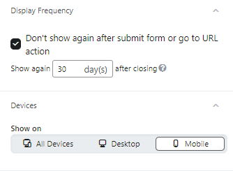
Once someone has closed the form, they are obviously not interested. So why show them the same form 5 hours later? You can choose not to show him the form for the next 30 days and then retarget him.
Also, your eshop experience is not the same on desktop and mobile. So choose a different creative or even form type depending on where your form is displayed.
Target with surgical precision
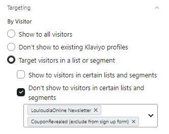
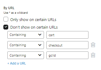
The most powerful aspect of email marketing is targeting potential and existing customers with surgical precision. So you can only show your form to users who are not already subscribed to your subscriber list. To those who already are, you can show a form with different content so that you can get to know them even better.
At the same time you can exclude specific pages where you do not want your form to appear. A typical example is excluding the order form from anything that might distract a user who is about to complete their order.
How to create the ideal registration form
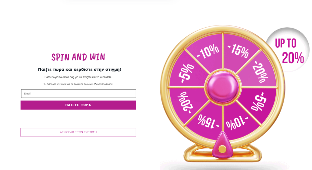
The collection of emails as we said is vital. You need a quality list but when this is combined with quantity, we're talking about an explosive combination! So you need to provide a very attractive incentive to get your customer's most valuable asset. And to do that, you need to give the best you can as a business (remember that will apply to the first order only). At the same time, you can make the whole process enjoyable for the user and get their attention, as if they are taking part in a game.
Wheel of fortune and registration incentives
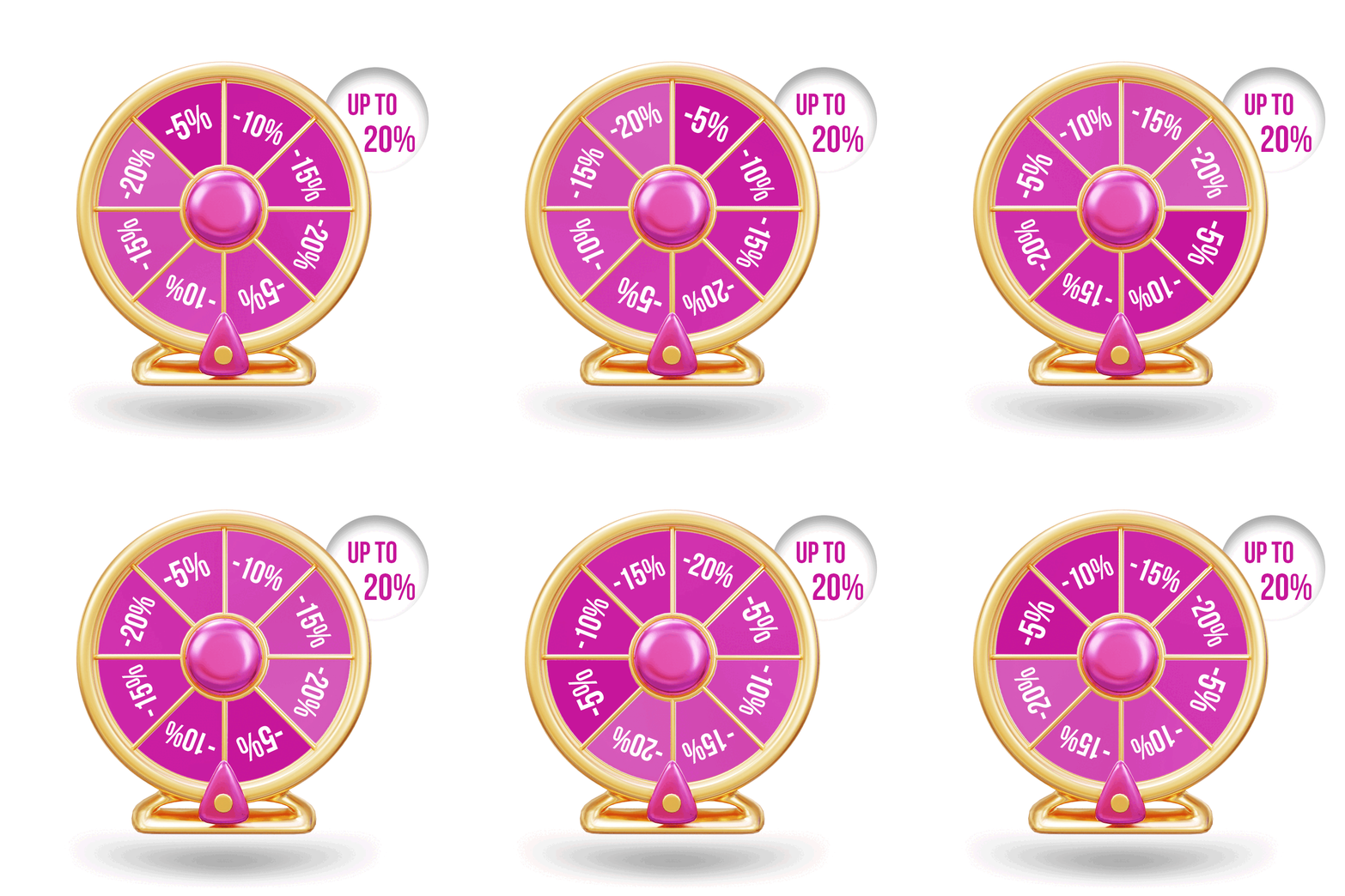

The result was 10% form submission rate and 250 subscribers per week. So within a month we got 1000 subscribers who, apart from placing their first order because they were motivated, are now potential repeat customers.
Constantly improve your forms
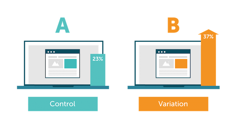
We reached this level by testing different form categories and different timing as to when to display the form. So A/B testing is an integral part of any strategy we have.
If you need help understanding whether email marketing would be rewarding for your business and how it can become part of your marketing strategy, we are at your disposal. Without any obligation, we can do an email Email Marketing audit and suggest improvement strategies. In our company we provide email marketing services to ecommerce partners-owners all over the world and we are always ready to help you achieve your goals.


