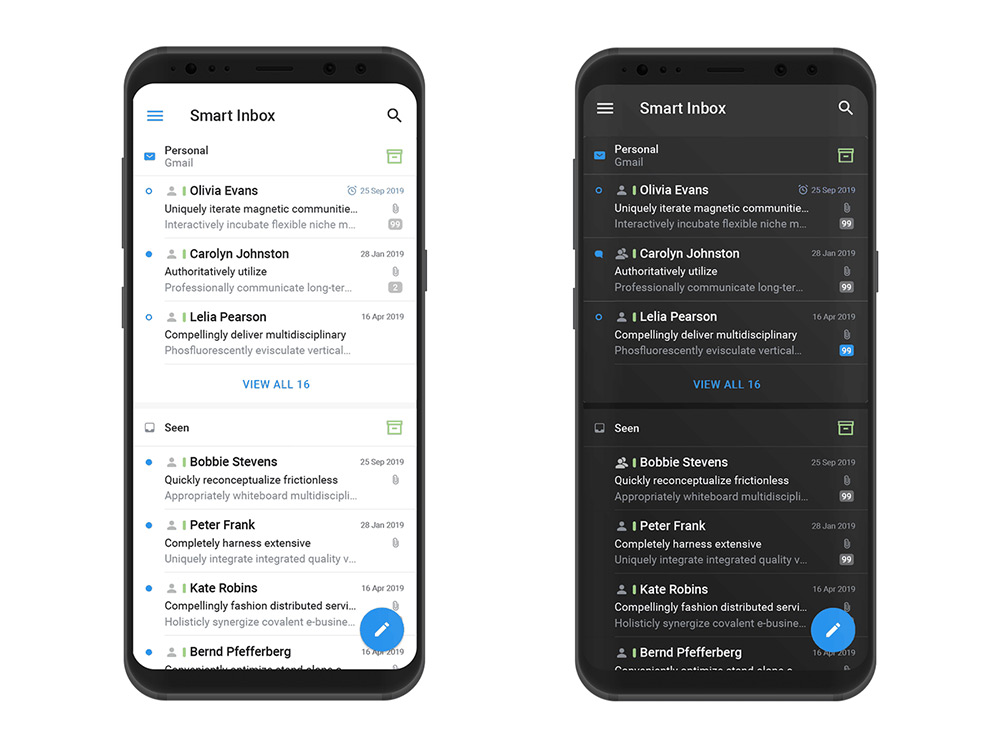
In today's mobile world, more people are accessing email from their smartphones and tablets than ever before. In fact, a recent study found that over 60% of emails are now opened on mobile devices. This means that optimising your mobile emails has become essential if you want to reach your audience and get results from your email campaigns. In this article, we'll cover some mobile optimization best practices, examples of successful mobile-optimized email campaigns, and the latest mobile email trends.
Best practices for mobile optimisation
- Use responsive design: Responsive design is a design approach that automatically adjusts the layout and content of your email to fit the screen size of the device on which it is displayed. This ensures that your emails look great and are easy to read on any device, be it a smartphone, tablet or desktop.
- Keep it simple: When it comes to mobile email, less is often more. Keep your emails simple, with clear headlines, short paragraphs and plenty of white space. This will help your message stand out and be easily digestible on a small screen.
- Use mobile-friendly fonts and images: Choose fonts and images that are easy to read and load quickly on mobile devices. This will help ensure that your email is easy to view and won't slow down the recipient's device.
- Use of single column layout: Reading a single-column layout is easier on a handheld device than a multi-column layout. It also helps to ensure that your email looks good and is easy to navigate on a small screen.
Examples of successful mobile-optimised email campaigns
- Nike: Nike's mobile-optimized email campaign used a responsive design to create an email that looks great on any device. The email features a clear call to action and uses simple, legible fonts and images.
- Uber: Uber's mobile-optimized email campaign uses a one-column layout and clear, concise messages to grab the recipient's attention. The email is also designed to be quickly and easily read on a small screen, with short paragraphs and plenty of white space.
- Starbucks: Starbucks' mobile-optimized email campaign uses a design that features bright, striking images that look great on any device. The email also includes a clear call to action and a simple, easy-to-read layout.

Latest mobile email trends
- Dark Mode: Dark mode is a popular trend in mobile device design and is now used in email as well. Dark mode can help reduce eye strain and make it easier to read emails in low light conditions.
- Interactive content: Interactive content such as quizzes, polls and surveys are becoming increasingly popular in mobile emails. Interactive content can help increase engagement and make your emails more fun and engaging for your audience.
- Video content: Video content is another trend in mobile email. As more people are watching videos on their smartphones and tablets, adding videos to your emails can help increase engagement and increase conversions.
Conclusion
Mobile optimization is vital to the success of your email campaigns. By using responsive design, keeping it simple, using mobile-friendly fonts and images, and using single-column layout, you can create emails that look great and are easy to read on any device. And by keeping up with the latest mobile email trends, such as dark mode, interactive content and video, you can stay ahead of the competition and create emails that engage your audience and drive results.
If you want to take your online business to the next level by applying our tips on optimizing your emails for mobile devices, ask us for a free email marketing consultation to show you how we help online businesses increase their revenue. Some examples you may have already seen in case studies Just book your seat with us.


